

The decline of automotive branding.
Logos, branding and equity.

I have been archiving the automotive industry since 2004 via the Cartype Archives.
While I try to address varied categories of the automotive industry, I primarily do so through the lens of design, branding, photos, emblems, marketing, and other forms of creativity of this amazing sector.
In just over 130 years, the degree of innovation continues to surprise and amaze me.
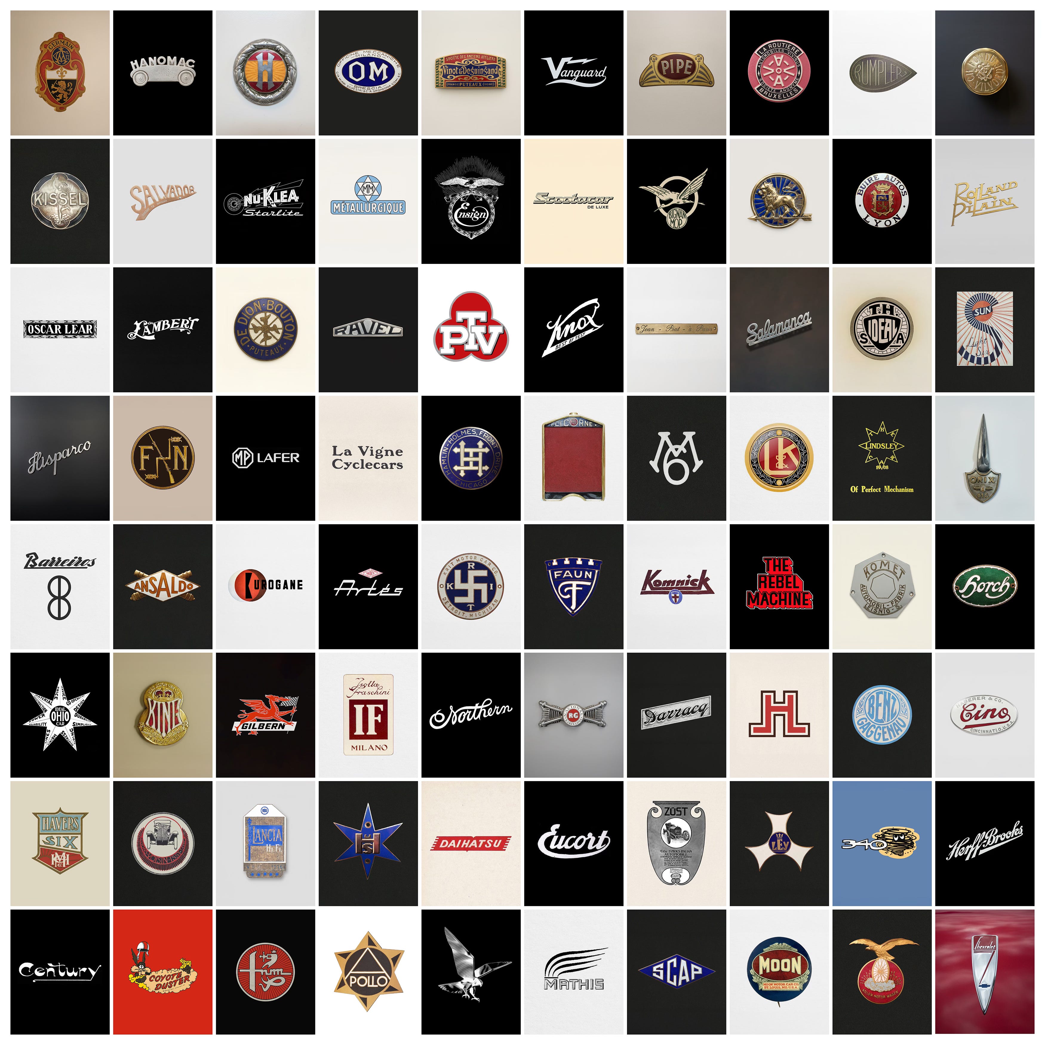
I am particularly attracted to the time when it was all done by hand embracing a more artistic approach.
The marketing and branding of a vehicle seemed to take as much effort as the vehicle itself. It was as full of pride, excellence, and craftsmanship as the vehicle it represented.
Many marks included historical stories, specifically designed characters, multiple uses of animals, and typography elegantly crafted and drawn by true masters.
These marks became part of the vehicle’s aesthetics. They were embedded in the personality and attributes of the car and represented the optimistic approach to general design of the time.
I have documented endless examples and each time I am exposed to a new one I think that I have covered them all. Then a new surprise seems to always comes along and I see another amazing one that I have never seen before.
Naturally, through this process, I started to see more modern branding applications. Unfortunately, I see examples of brands that have had a historical impact only to be turned into what I see as a travesty of graphic design.
I have been meaning to write about this for some time, but the current redesign of the Chrysler logo pushed me over the edge. It was introduced with the Chrysler Halcyon Concept in 2024. It was developed internally by the design and brand teams at Stellantis and led directionally by Chrysler’s design leadership under Ralph Gilles (Chief Design Officer of Stellantis).
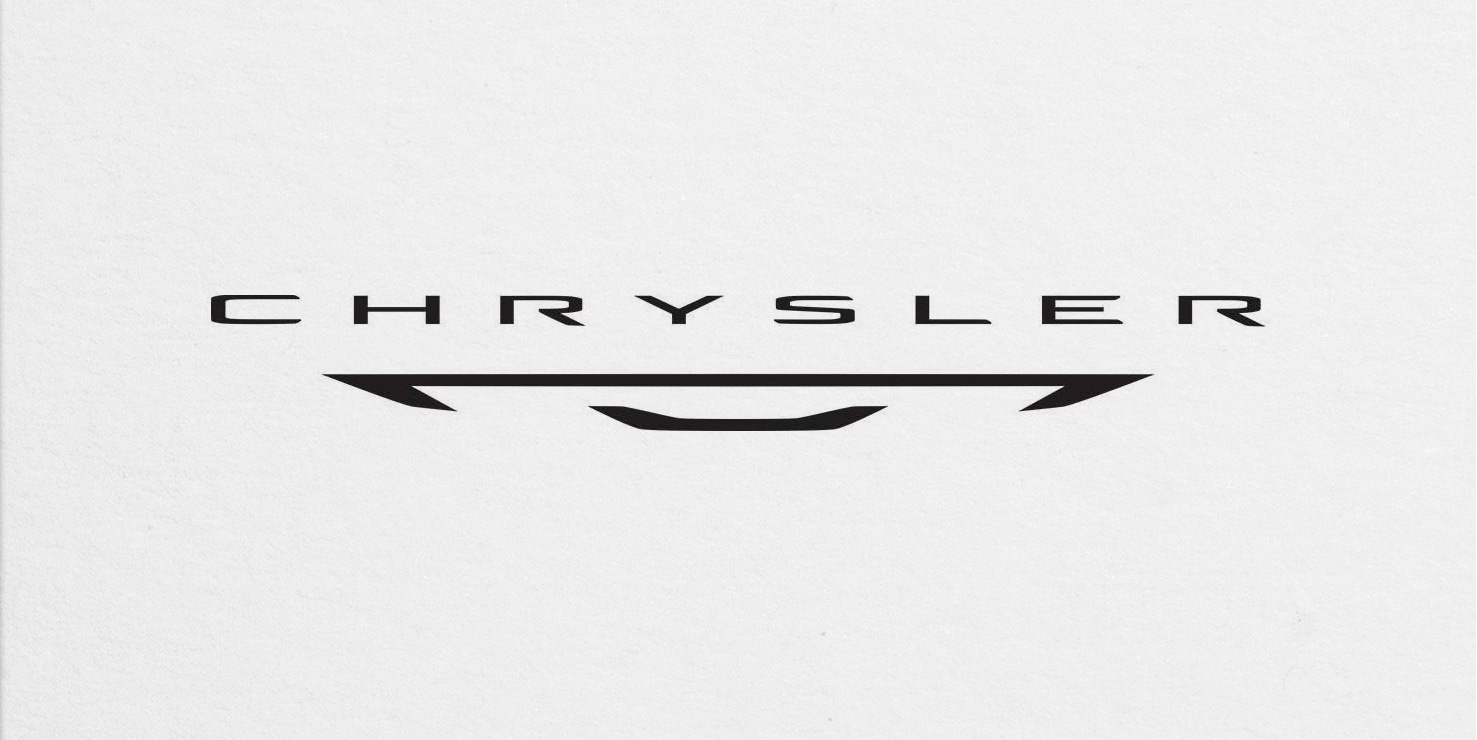
Chrysler has had many variations of their logo and emblem, but below are just a handful of examples that the new logo above replaces.
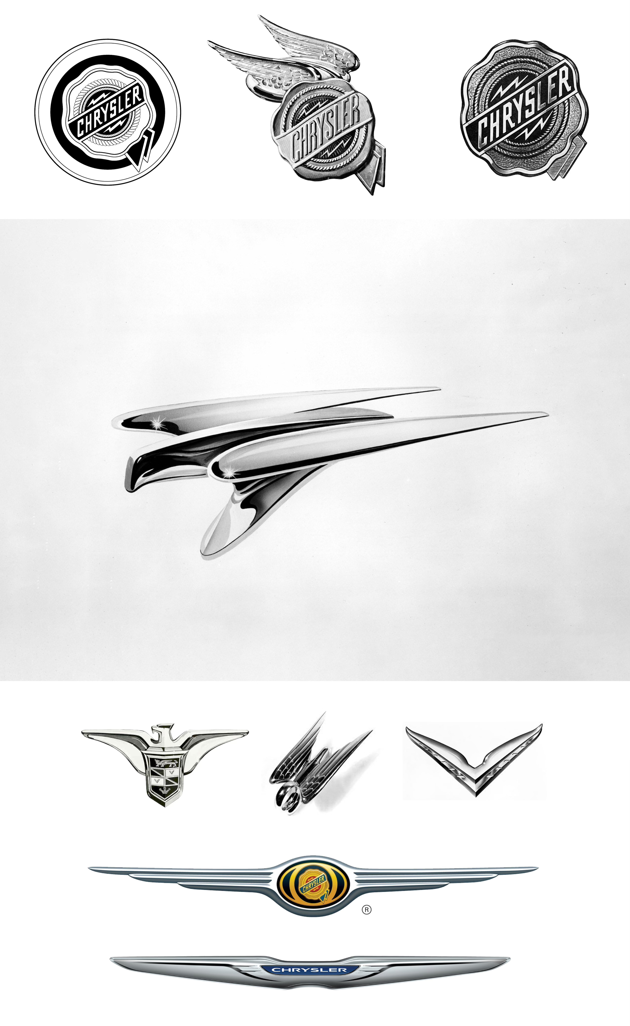
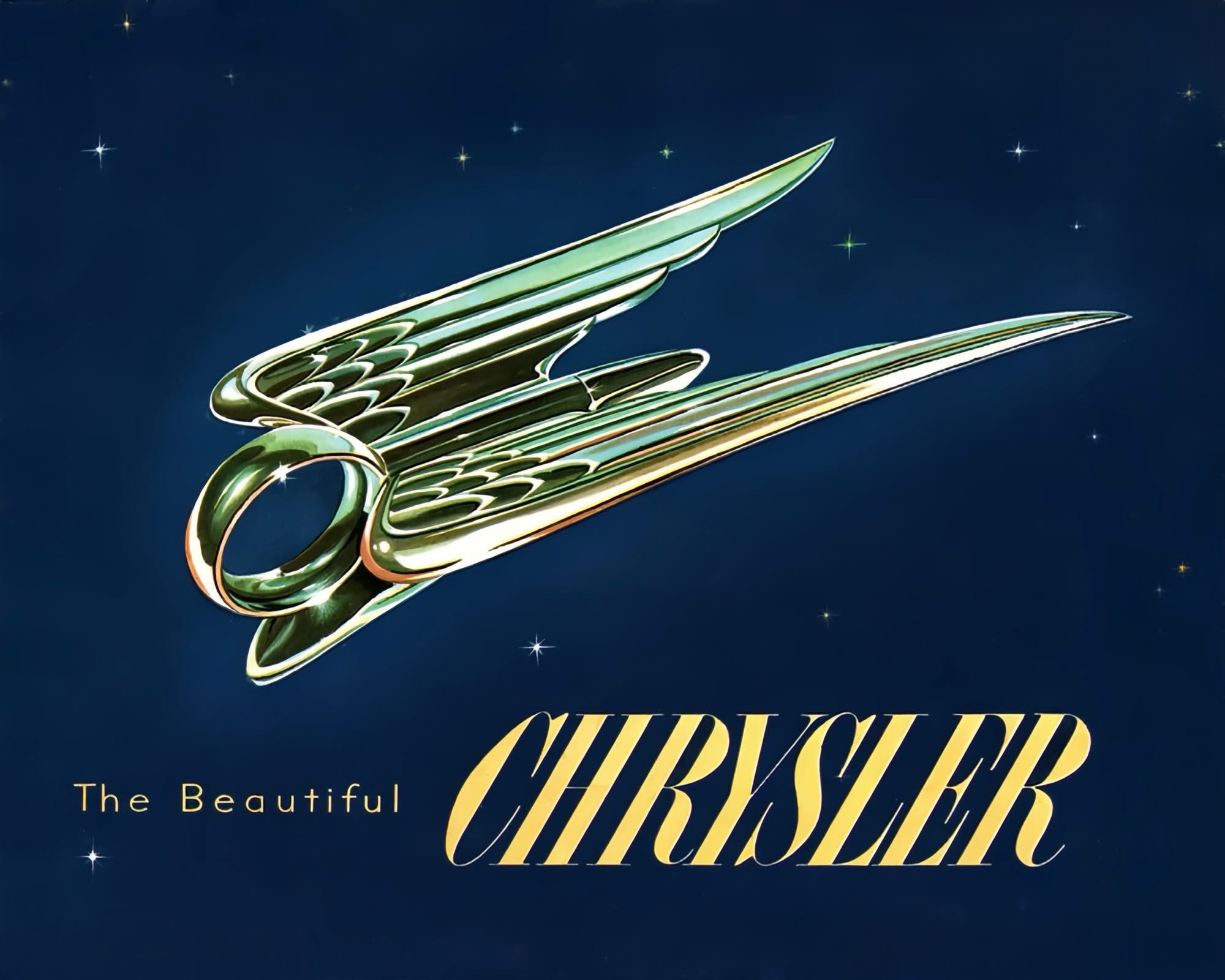
Of course, some would argue that all of this is just a matter of opinion, but I do believe that there are craftsmen and creative leaders that posses the capacity to guide the rest of us towards a more refined and mature aesthetic, however I feel something has been lost in the new executions.
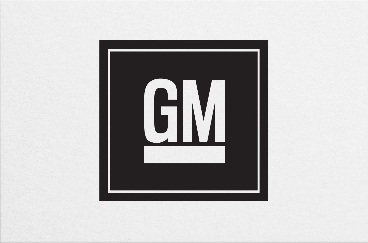
The GM logo.
The current GM logo was updated and released in January of 2021. It was created in collaboration with the brand consultancy Wolff Olins.

The update was part of GM’s broader electric vehicle strategy and repositioning, aligning with campaigns like “Everybody In,” meant to present GM as a forward-looking, tech-driven mobility company.
In my view, there is nothing here that speaks to “everybody in”, “electric vehicle strategy” or even “forward-looking”. In fact, one of the main reasons I dislike this approach is that it embraces an “art-deco” typographical feel with an early 2000s dated gradient, at a time when GM was all about “the future”.
While the previous underlined, upper case GM in a blue box was arguably not the best, it did have better readability, reproduction and certainly history.

The destruction of brand equity.
Then there is the self inflicted wound. And the BMW “M” brand is the catalyst for this rant.
In 1972, BMW founded BMW Motorsport GmbH as a wholly owned subsidiary, built specifically to handle racing and high-performance development and led by Jochen Neerpasch. In 1993, BMW Motorsport GmbH was renamed BMW M GmbH.
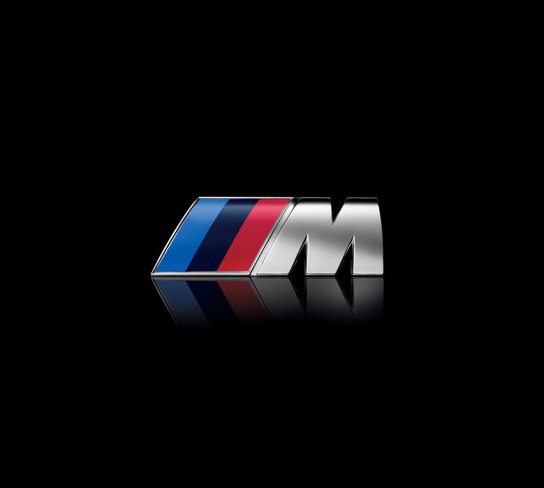
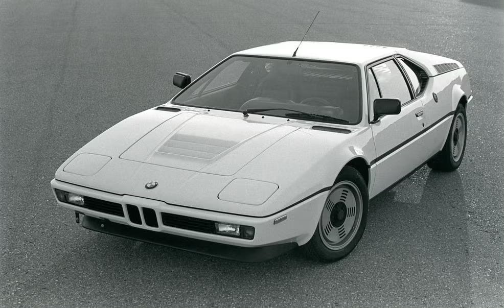
The first true BMW “M” car was the BMW M1 (introduced in 1978). It was designed as a homologation car for racing with styling by Giorgetto Giugiaro.
Early examples like the BMW M535i (1979) bagged started the watering down of the “M” brand trend, but during the 1990s–2000s BMW began concentrated brand expansions with “M Sport” trim packages becoming widely available with “M” branding appearing on steering wheels, shift knobs and exterior trim. This is when “M” started becoming lifestyle branding.
There are now three different levels of “M”. Full “M” cars (M3, M4, M5), middle tier “M Performance” models like the M340i and M550i, and the “M Sport package” (mostly cosmetic) and where most of the confusion comes from.
It has become so bad that the consumer has switched from knowing that “M” stood for Motorsport, to now seeing it a simply representing “marketing”.
The obvious downside is that it dilutes the meaning of “M” by creating confusion about what’s “real” and many enthusiasts have begun to push back.
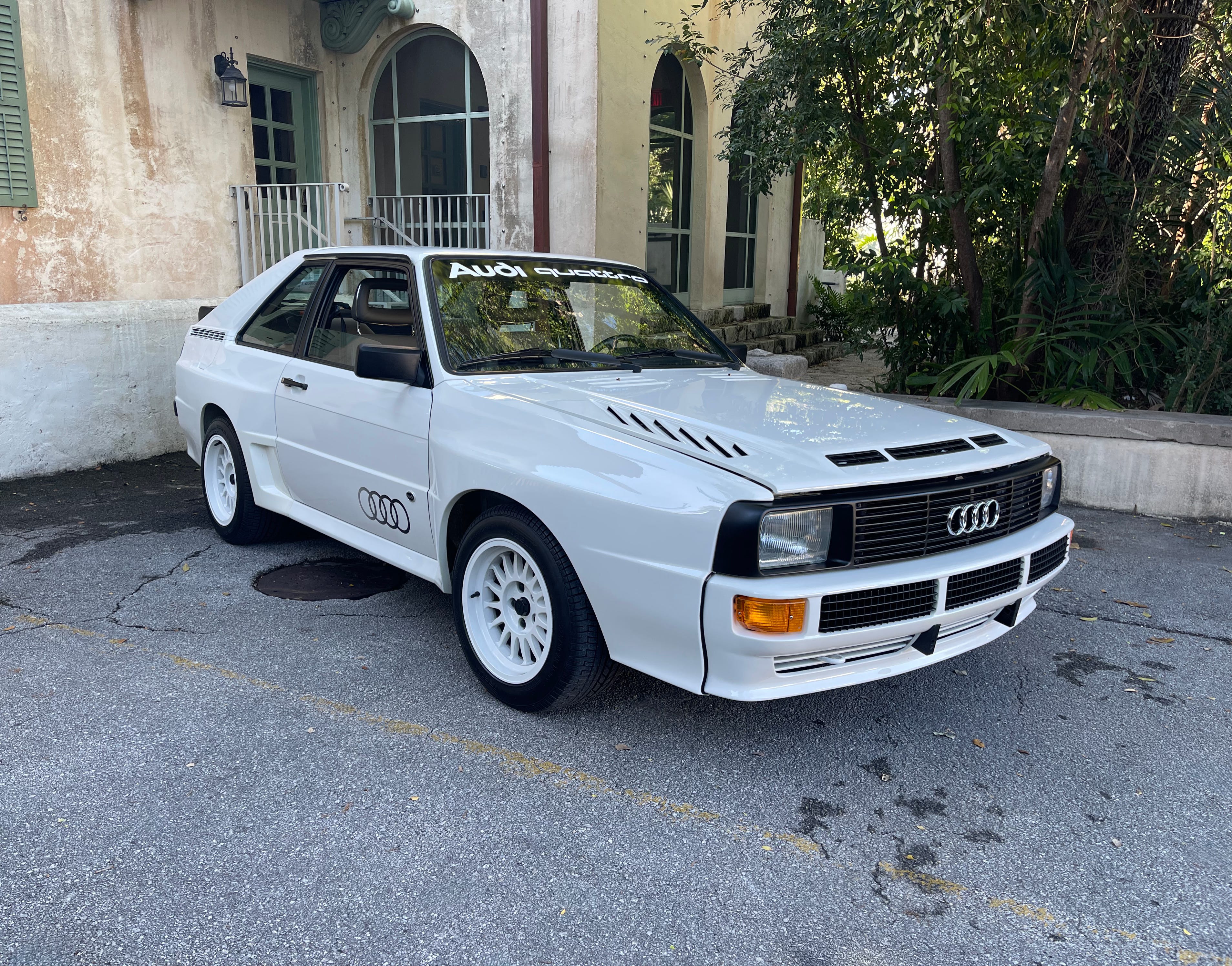
Of course BMW is not alone. Audi has followed with the “S” moniker in the same manner by slapping “S line” on anything they can sell for more. The “S line” is a sport appearance package, not a full performance model.
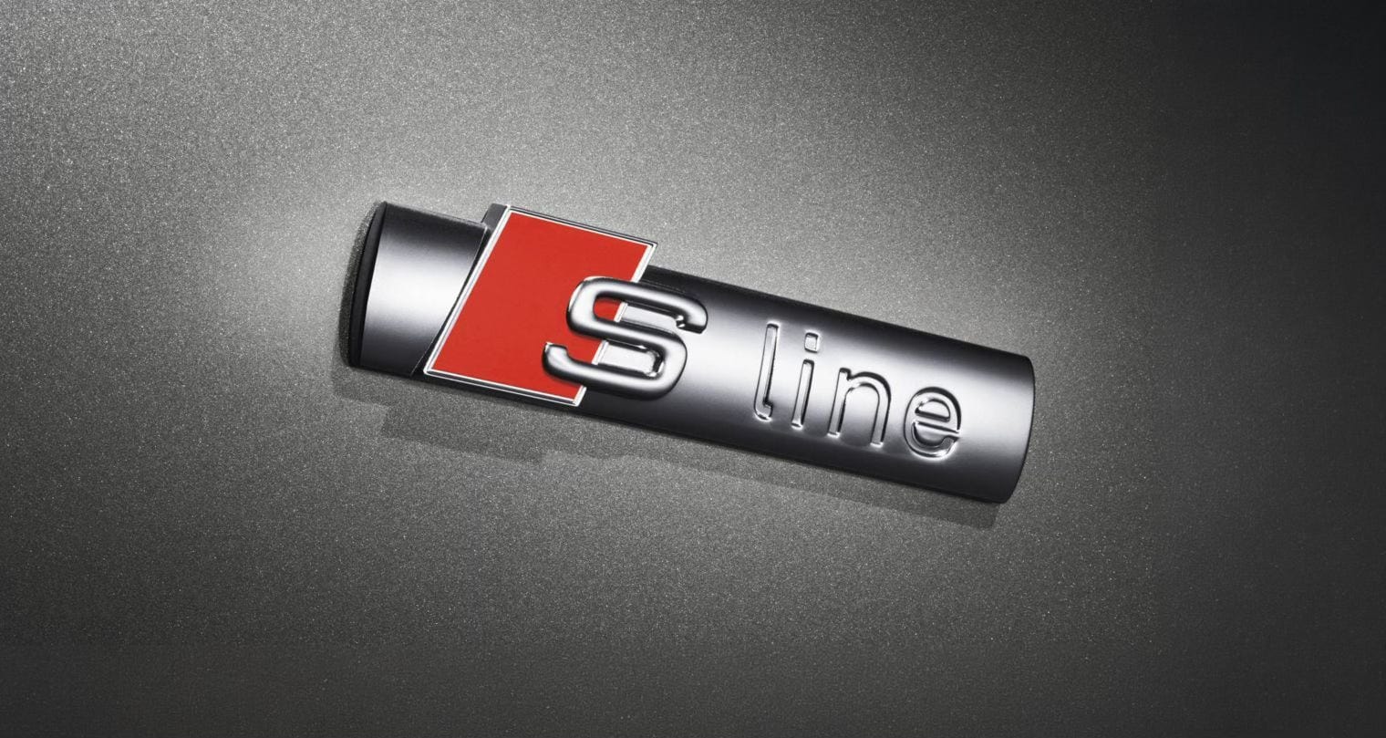
The first true “S” model from Audi was the Audi S2, introduced in 1990. Before the S2, Audi’s performance identity was led by cars like the 1984 Audi Sport quattro, but they didn’t use the “S” naming.
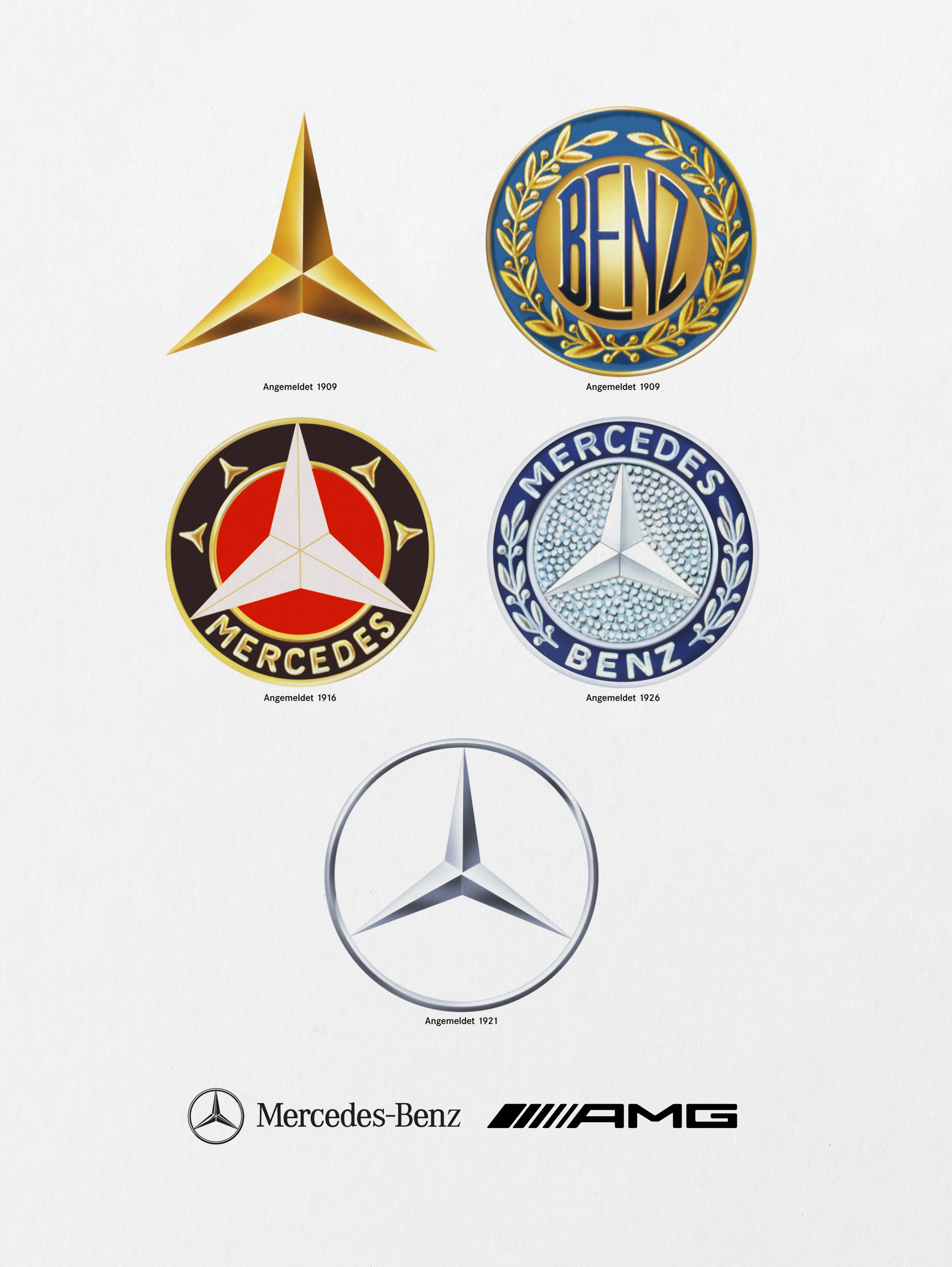
Mercedes and AMG.
As I was writing this post I came across this well documented subject by Carisma called “The Day Mercedes Stopped Building Cars for Their True Customers”. It covers the brand’s twenty year decline during a desperate need and desire for “volume”. It’s worth a watch.
Jaguar.
One can argue that the brand was in trouble and needed something fresh. Clearly. Their sales were abysmal. But it wasn’t because of a logo. It was because theirs cars did not measure up.
The answer was not to erase their astonishing past, eliminate the brand’s loyal market and reposition the company similar to a perfume. The brand consciously removed all historical images from all of their social media platforms. This was the most self inflicted damage I have seen in recent time. I hope they make it and come up with something desirable. And I am probably going to be proven wrong, but while I actually like the concept shown, and have nothing against EVs, I don’t see how a $100,000 plus, huge luxury electric sedan is going to do it.
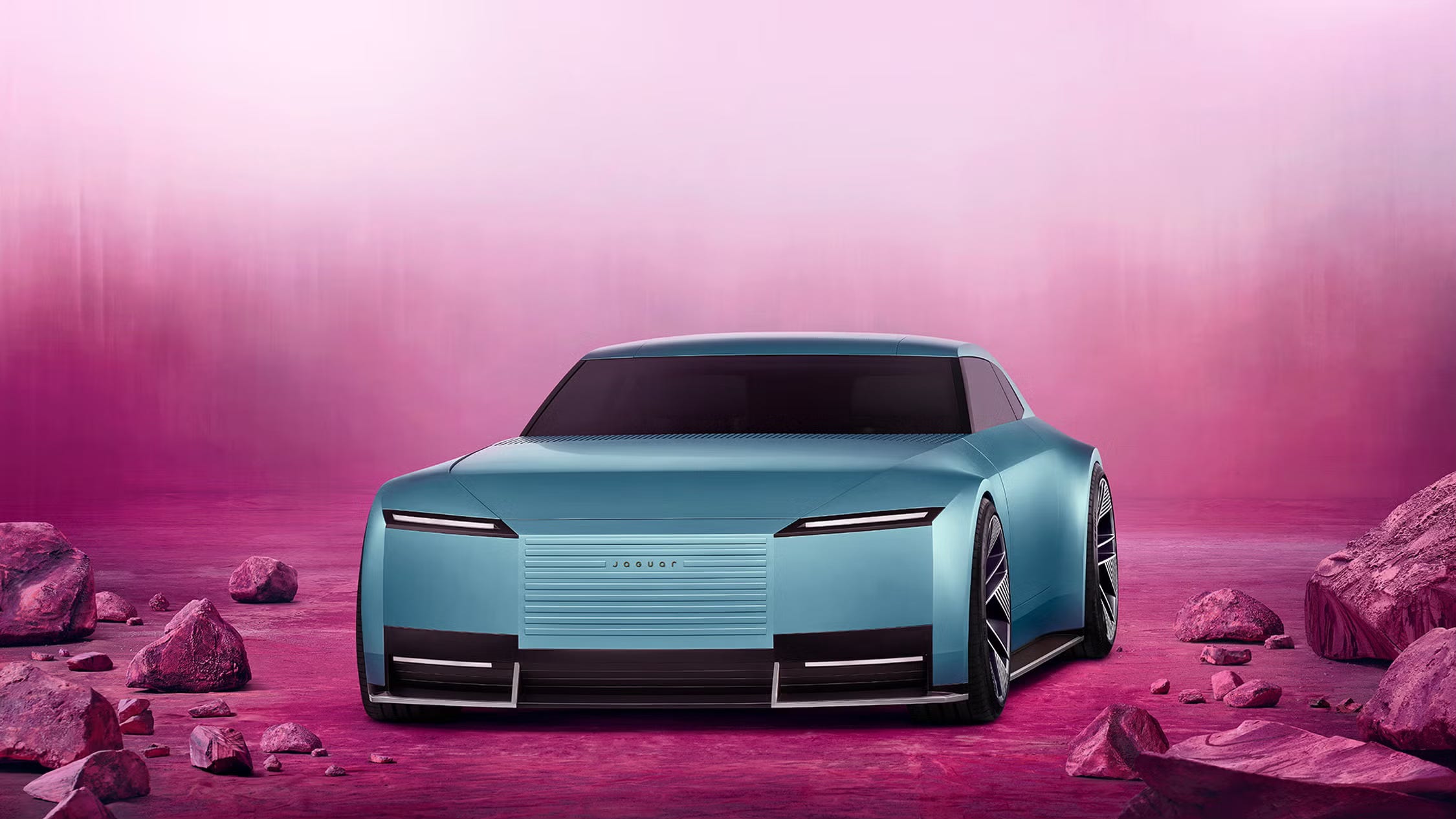
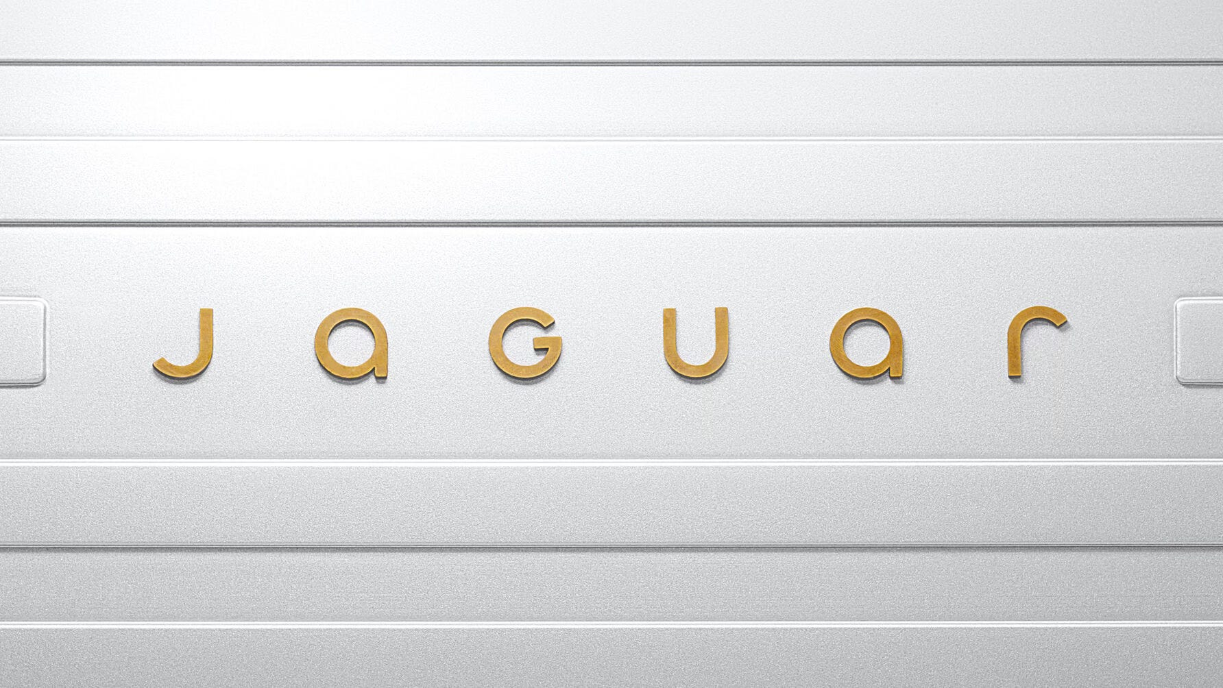
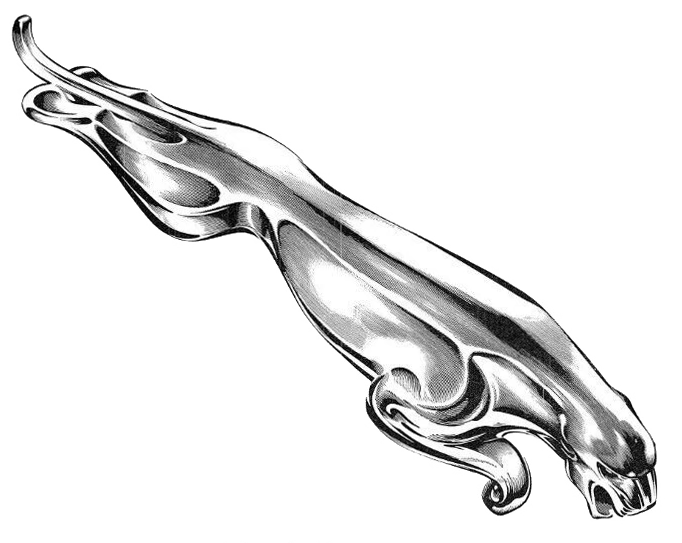
And I haven’t even talked about the logo, which was introduced in 2024 as part of a major brand reset led by Jaguar Land Rover’s in-house creative team that introduced a minimal, fashion-like wordmark, and removed the classic “Leaper” (jumping jaguar symbol) from primary branding.
Jaguar began as Swallow Sidecar Company, later becoming SS Cars Ltd. The name “Jaguar” first appeared in 1935 on the SS Jaguar models but the company didn’t become Jaguar Cars until 1945.
The Leaper quickly became one of the most recognizable hood ornaments in automotive history. Jaguar then introduced the “Growler” front-facing jaguar head as a grille badge in the 1950s.

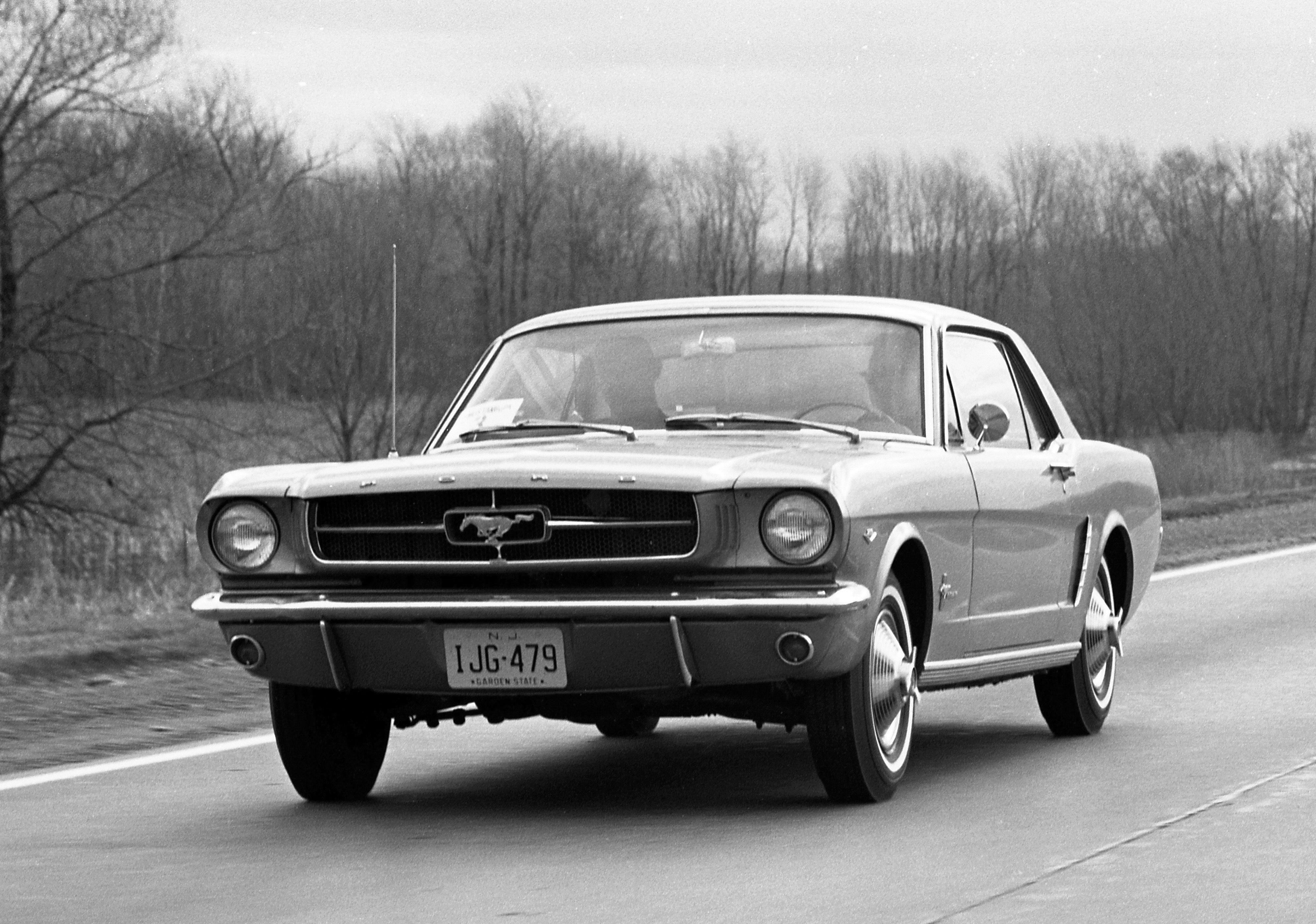
The Ford Mustang.
This car is as American as it gets. The Mustang debuted on April 17, 1964 at the New York World’s Fair — and it was an instant sensation. Over 1 million units sold in just 18 months, making it one of the most successful launches in automotive history.
It was developed under Lee Iacocca and it created a whole new class: the “pony car”. There are countless models of this car, now in its seventh generation.
The Mustang isn’t just a car—it’s a cultural icon. It is a symbol of freedom and individuality and has deep roots in American car culture. It is one of the longest-running nameplates in automotive history.
In 1969, Ford Motor Company introduced the Mach 1 to reinforce the Mustang’s performance identity and compete in the growing muscle car market.
It was special because it came standard with V8 power (no six-cylinder option). It had a distinctive “shaker” hood scoop attached to the engine, matte black hood treatment and bold striping with sportier interior and woodgrain accents.
It was an immediate success—over 72,000 units sold in 1969 alone, making it one of the most popular Mustang variants ever.
So imagine my disgust when I learned that Ford decided to come out with an electric SUV, and call it a Mustang Mach E in 2019.
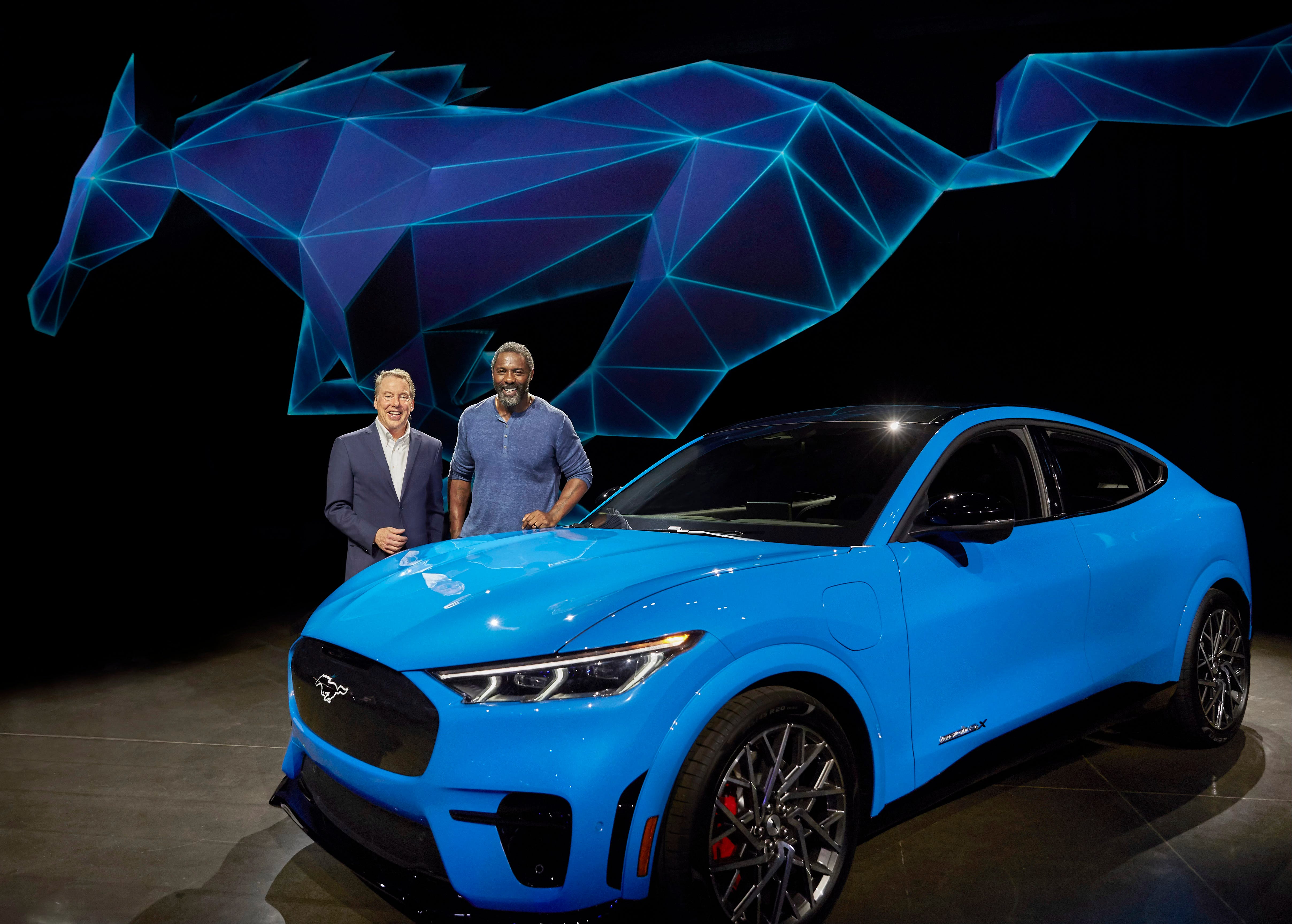
To be very clear, I have no issue with electric cars, and I actually like the look of this EV SUV. I just can’t understand why in all of the meeting they surely had, no one put a stop to using the equity of the Mustang brand like this.
Many Ford Mustang enthusiasts and traditionalists are extremely upset at the company’s decision, and I completely agree.
Other examples of this decline for me includes fake exhaust audio in the cabin, calling a four door sedan or even an SUV a “coupe”, labeling an electric vehicle a “turbo” model, expanding the subscription model on features like heated seats, creating non repairable parts, and eliminating the consumer’s right to repair.
These habits are now industry wide.
I could not agree more Carlos. I understand that car maker must grow, change and chase sales and market share but as you have explained in the dilution of ///M and highlighted in the Mercedes video, there is a delicate balance needed to retain what makes a car brand great. I remember going to a national car show here down under and visiting the BWM stand and chatting to one of the sales people (as I do) and mentioned that I had recently restored an ‘02’. He replied, ‘whats that?’ It was the moment when I realised that not everyone in the motoring world is an enthusiast. But my faith was restored when I first visited a BMW event in America to see BMW race cars piloted by BMW North America senior executives.
The passion still exists and hopefully guides the evolution of the marque.
My favorite CARTYPE post. I totally agree. It is great to hear your passion about the design and nomenclature. If only the manufacturers would listen to you!